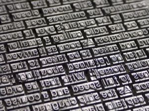
Movable type is a system of printing and typography that involves moving individual letter components to reproduce the elements of a document.
The worlds first known movable type system for printing was created in China around 1040AD by Bi shang during the sang dynasty (990-1051) using clay.The administrative tablet was found in the Uruk region between 3100-2900BC believed to record stock levels.
The first metal movable type system for printing was made in Korea during the Goryeo Dynasty
(around 1230).
Neither were used very widely mainly due to the extreme time and effort to manipulate each letter.
Johannes Guttenberg invented what is known as the first moveable type in Europe. He was the first one to create his letter pieces from an alloy of lead, tin and antimony - the same components that are
still used today.
This development in printing helped people to read with the growing access to books, leading to improvements in education, sciences such as medicine, arts and religion through the transmission of text.
The Gutenberg Bible was a 42 handprinted bible, the first of its kind, published in 1455, the first book to be published in volume. Previously each bible had to be hand written.
"The Gutenberg printing press developed from the technology of the screw-type wine presses of the Rhine Valley. It was there in 1440 that Johannes Gutenberg created his printing press, a hand press, in which ink was rolled over the raised surfaces of moveable hand-set block letters held within a wooden form and the form was then pressed against a sheet of paper."
Tuesday, 8 February 2011
Wednesday, 2 February 2011
Link to 8 ways to combine typefaces!
I found this on Barry Madden's twitter and thought it was useful in learning some typography rules when it comes to combining different typefaces.
http://www.webdesignerdepot.com/2011/02/eight-ways-to-combine-typefaces/?utm_source=twitterfeed&utm_medium=twitter
http://www.webdesignerdepot.com/2011/02/eight-ways-to-combine-typefaces/?utm_source=twitterfeed&utm_medium=twitter
typographic website
I found this a very interesting website, it was not only visually interesting and inspirational but it also had concise and useful information about the history and evolution of typography, including a timeline of when popular fonts were created, the anatomy of type and studies such as image legibility.
http://www.rsub.com/typographic/
http://www.rsub.com/typographic/
Monday, 31 January 2011
My first year typography project
We were given a brief to show a given font's good qualities. I was given Clarendon. I conducted some research and found out that it used to be used for wanted posters. I decided to use this fact to build my poster around, representing Clarendon with a personality to help explain it's qualities. This is my final poster:
Thursday, 27 January 2011
Intro to typography
Ever since our new typography brief I have been on a mission to gather information on typography to help me get a better understanding for the subject, in a bid to produce the highest level of work I can.
I wanted to just start off by looking at images on google to show me how it can be effectively used. The amount of scope with sizes, shapes achievable and of course the use of different fonts means that any arrangement can be made possible, amazing pictures have been built up using just text. I also found creatively made text interesting, where other objects have been adapted to create letters. The placement of text can also be very visually interesting, it doesnt have to make a picture but the lining up and new shapes created can leave you studing a piece of typography for ages.
Here is a mixture of some of the images that I found most interesting:
Subscribe to:
Posts (Atom)


